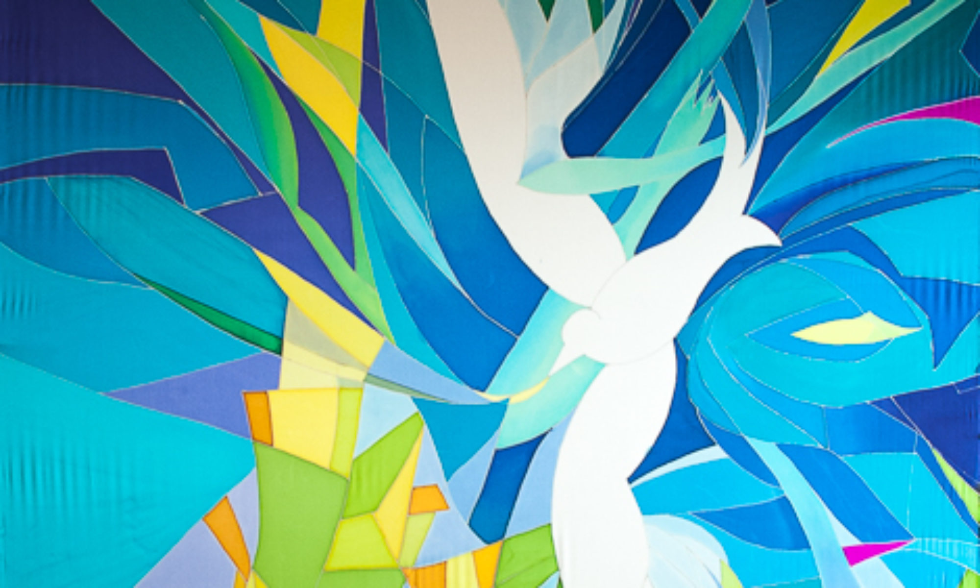
Baptismal Waterfall with River Banners to surround the congregation
I am in the beginning stages of designing a large project for a Northwest church…Here you can see how I start playing with the ideas. I’ll keep you posted as things progress. Nothing is for sure yet…but I hope the designs are accepted. Here are three versions of a waterfall, sketches in pastel…
  Â
  

Only one of these three designs would be selected, and quite possibly altered to meet the needs of the church. The final banner would hang behind an alter that opens up to a baptismal font.
It would be about 30 feet long, and up to 8 feet wide, hand painted silk dye on silk Charmeuse.
The composition to the right here is my favorite I think. But I do like the yellow light in the sky of the other two. Maybe a combo?
What do you think? Leave me a comment.
Furthering the River theme would be several 8’x4′ panels on the walls depicting macro images of a river flowing from the waterfall and embracing the sanctuary. Here is an example of one of these sketches, done in watercolor, and a second one below.
I sure hope this project flies, as I’d love to do it. But you never know until the contract is signed. Send me good thoughts or prayers if you are inclined. And to the church that would commission these. I’d love to do this project.


I’m drawn to the movement of the water in the right one and also like the use of the yellow and purple in the others. Looks like your on the right track. Love that your letting us peak at your process. Blessings to you as you create.
It’s fun to share ideas. Making art can be a solitary endeavor, and this is one way to continue making art in community, which feeds my extrovert half. Thanks for your reply!
I also love the bottom right sketch best. I think that the traversing waters ties in nicely with your celtic knot theme. I also like the neutral colors around the edges of the water. What about a yellow sunbeam through the composition? Looks beautiful. Good luck!
Thanks Johanna. It was fun talking about your installation piece on the phone today.
Bottom right is most dynamic to my eye because of breaks toward bottom of falls…. Reminds me of Ten Mile Falls! I love the idea of the companion pieces, leaving the sanctuary awash in the river of life (coming up in the Revelation reading for Easter 6). The blues of the companion pieces are exquisite. Amazing how sky and “sea”, above and below, are “blue as God’s eye” (per the play “Julian” by J. Janda).