Rooted and Grounded in Love

A Meditation on Ephesians 3

©2014 Kristen Gilje
©2014 Kristen Gilje, commissioned by St. Marks by the Narrows, Tacoma, WA

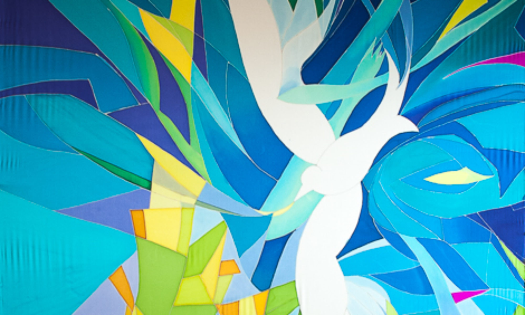
The Ephesian 3 text was chosen by St. Marks Lutheran Church by the Narrows, Tacoma WA for their 60th anniversary. This letter from Paul talks in part about the cosmic nature of God and paradoxically how God is also present with us in our earth-bound existence.

I chose a tree to represent the union of the vast, cosmic nature of God and the earthly nature of our local lives in community.   This tree is a version of the tree of life, an archetype that spreads throughout human culture. A tree reaches towards the sky and onwards towards the planets, while being rooted firmly in the ground. It is a reminder that we are indeed connected to the world and universe outside our daily and earthly routines, even though we often forget. Here it represents both the wood of the cross alive, and Christ as connecter of heaven to earth.

In my first sketch for  this design I made the tree stretch tall and strong, up to the planets. And I made a tap root that stretched down, down, deep within the earth and anchored by subterranean rocks. I sent this design off to the commissioning pastor, who wrote back asking me to please put a few more trees in the composition.

This pastor grew up on the coast. He knew that trees growing on the western coast of North America don’t have deep roots; they have shallow roots. And they grow in groves. The shallow roots of the trees intertwine with one another to support each other. A shallow-rooted tree growing alone would get toppled by coastal winter storms, but a grove of trees with an intertwining root mass can withstand all nature can throw at them.

So I put some more trees in, made the roots more horizontal and intertwining.

The houses under the central tree represent our human community, specifically the community of this particular congregation. Our relationships are like roots that reach out to one another in community, and hopefully out even further  to support those considered outside of our community, to support them too.

Kristen Gilje, Rooted and Grounded in Love Det.

And finally, the vast quantities of water that make the Northwest so great in this piece also represent the water of life in Rev. 22, flowing from the throne of God,  nurturing the tree of life which bears good fruit for all. My prayer is that this same Spirit of God, present in, with and through all things will nurture our communities with all its relationships, humankind and other, so that we bear good fruit for the sake of all humanity and all the earth.


Breaking Wave as Baptismal Image

Commission for a Seaside Church

©2014 Kristen Gilje Breaking Wave
©2014 Kristen Gilje Breaking Wave, 8 feet by 55 inches, silk dye on silk.

I painted this 8 foot by 54 inch banner, for a church in Manasquan NJ,  immediately after finishing “Zion’s Waterfall.” I had enjoyed being very loose with the dyes, letting them mix and make textures without much control at all, using hardly any resist. In “Breaking Wave” I wanted to preserve the free and uncontrolled feeling with a different technique: painting with wax. This involved using the resist, which usually I use to control the dye, in a free and easy way. I bought 5 different sizes and shapes of brushes to make varying textures and painterly wax marks on the silk.

The process was similar to making a layered print. The very first wax marks preserved the white of the silk, only where I wanted highlights. Next I put a light layer of blues over the whole piece. After that dried, I put another layer of wax only where I wanted this light blue preserved….then a darker blue, and more wax, until I had all the color values I wanted on the finished piece, from lightest to darkest.

The original idea for this piece came from the pastor who commissioned it. Her congregation had been devastated by Hurricane Sandy in 2012, and her idea was to  make a Hurricane Sandy Baptismal Banner. The idea was an intriguing challenge. I love to connect natural images with sacred rite and ritual. After researching photos of the devastation on the web, I came up with the following image. However, I could not find any hope in the subject at all, no sense of the holy.

©2014 Kristen GiljeHurricane Sandy
©2014 Kristen Gilje Sketch for Hurricane Sandy Baptismal Banner

Even though this piece was more about the destructive forces of nature than the transforming sacred power of baptism, the commissioning pastor liked it.  I also had gotten quite attached to the idea of making this piece, not because it represented baptism, but instead the awesome and fierce power of nature, and the challenge of making it. NOT the intended goal…

The idea was to somehow lift the tragedy of Hurricane Sandy into the hands of God, recognizing the sacred water of baptism even in the terrifying walls of water in the storm. This was definitely too fresh a catastrophe for the idea to work. And the image represents “My God, why have you forsaken us?” better than baptism.  We realized that this image was not what her people needed, and changed course.

 Challenging art needs to be appropriate for the congregation it serves, and needs especially a person to facilitate discussion around the art, to lead people into challenging ideas with purpose. The purpose is not the art, but the idea.  And the idea must be carefully chosen. The art is a tool for thinking about the challenging idea.

The pastor knows their congregation and what they need the most, and how great or small a challenge they need, and most importantly what they need challenging on.

 We turned instead to an image more familiar and less challenging but still powerful: A wave breaking over rocks. I could indeed find the Holy here in the awesome power of water to transform even a rock, but also to nurture life and bring joy. It is a good image of the transforming power of baptism.

Here are pictures of my own exploration of a wave….first on newsprint 9 feet by 55 inches just learning shapes and values.

2014 Kristen Gilje

next a “map” simplified version, Still got carried away by the detail. I put this one under the silk to help me place the dye and wax.

2014 Kristen Gilje

This wax process was new for me…it was fun to have the WAX make the mark, rather than the dye.

My driving emotion for this piece is awe of the sacred in nature, despair in its failure, and hope/faith for change.This is now in a New Jersey church, as a symbol of the transformative power of the waters of baptism.


Zion’s Waterfall Up and Hanging

At Zion’s River , Tacoma, WA

This large 3-panel banner which I call a silk mural, was hung this winter, and really makes a presence as you walk into the sanctuary. It is 36 feet long and 8 feet wide. My task was to design “an abstract waterfall”, leaving room for interpretation.

Zion's WaterfallThe wall behind and around this silk mural was painted a medium dark brown to echo some of the rock colors, and to help enhance their videos. Apparently darker colors are better than light ones for this.

This church pushed me in a very positive way, from my comfort level of more representational art to more abstract work. I chose a very limited pallet of blues, with a bit of the complementary dark orange/browns, used value  (lights and darks) to drive the design, and really let the silk dye do the work itself instead of controlling it with a lot of detail.

Originally the mural was designed so the cross would hang two-thirds of the way up the banner. This would be on  the lower part of the dark stream coming down from the top, and above the white waterfall streams that are hitting the rocks.  I hope someday they will do this, but we’ll see. When an artist makes a piece it’s a bit like bringing a child into the world: you have to let go when they leave home.

If you would like to follow the process of designing and making this project, scroll down to see 4 or 5 earlier posts about Zion’s Waterfall. You can see the project morphed quite a bit, before we settled on a final design.